2014
Short Path Distillery
Logo & Identity
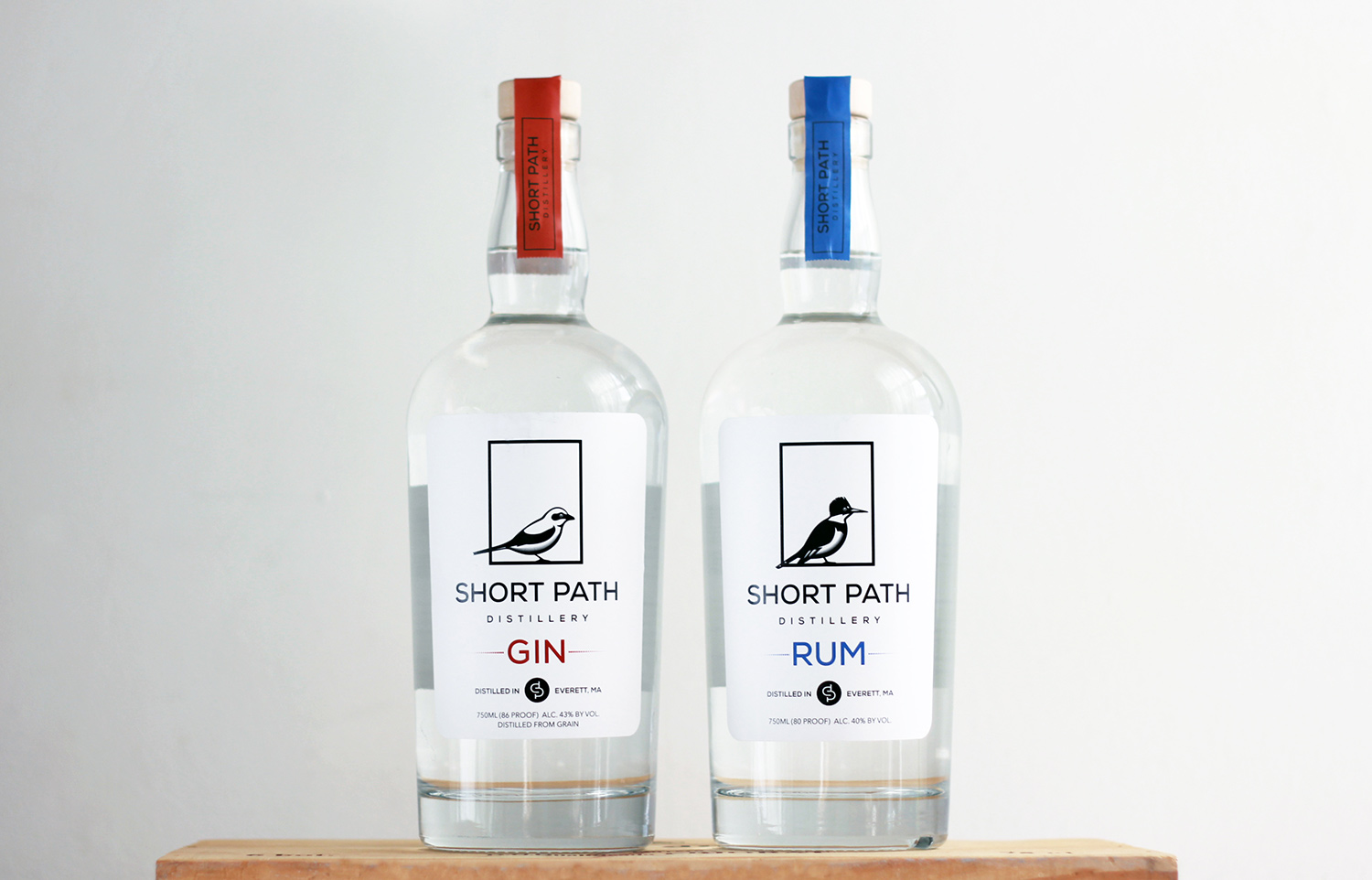
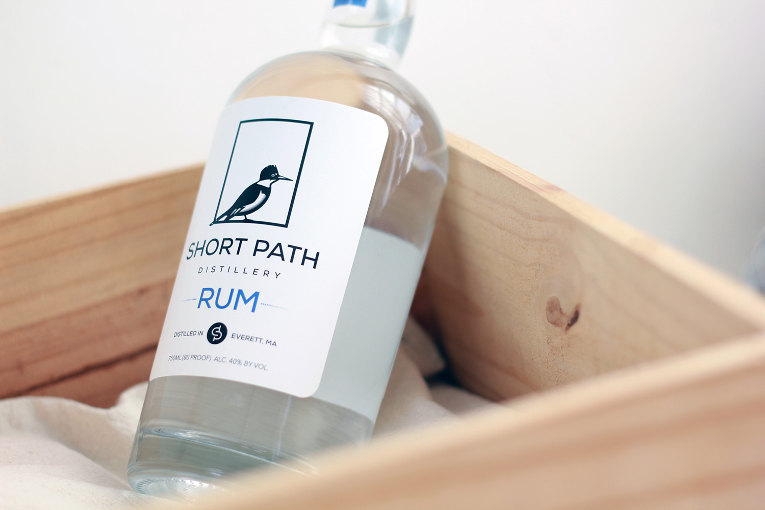
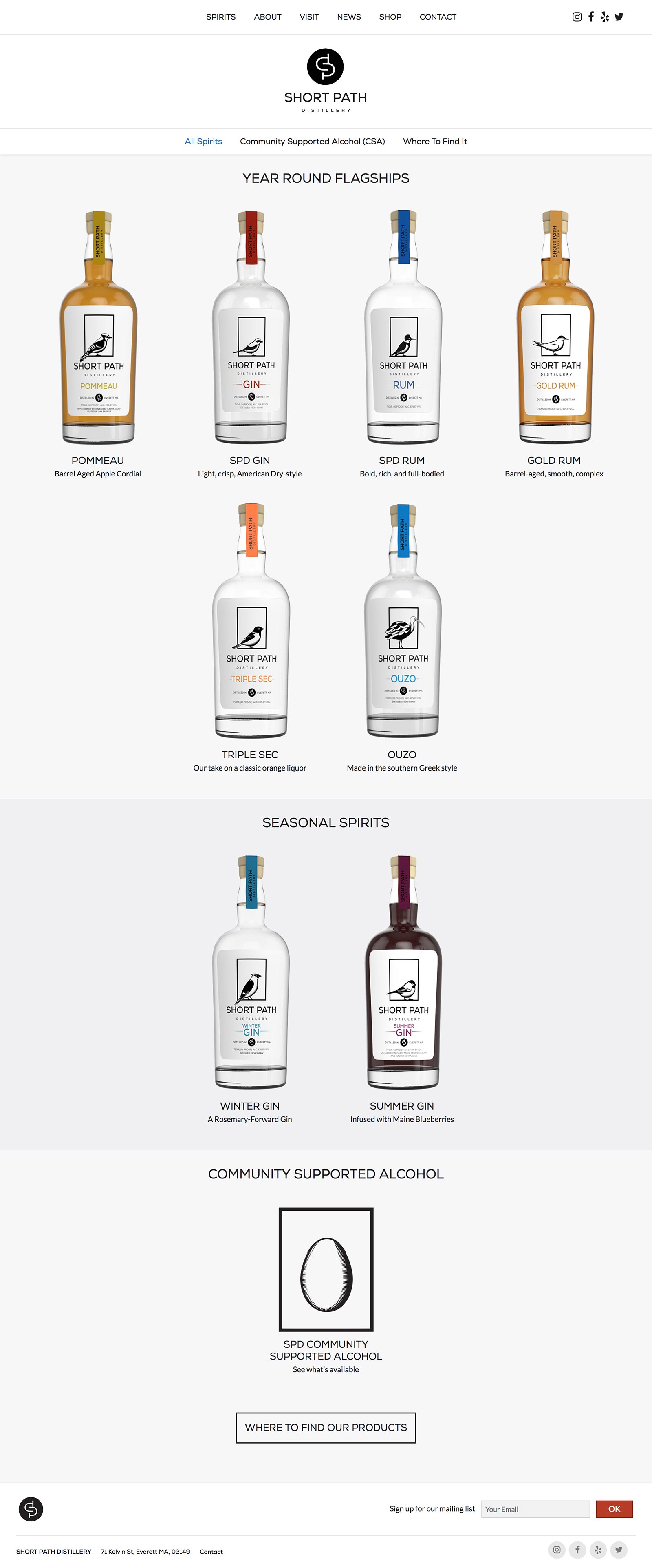
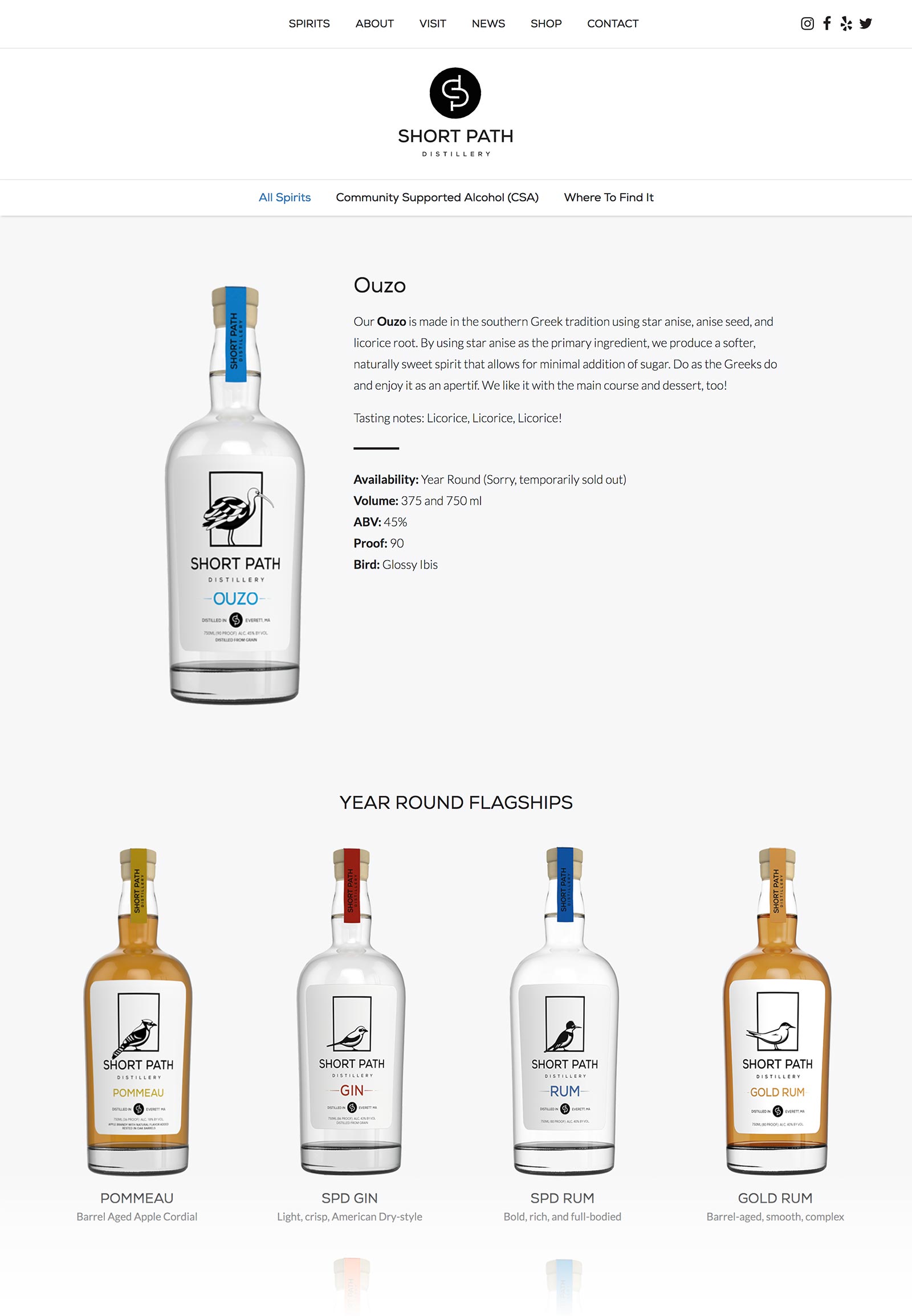
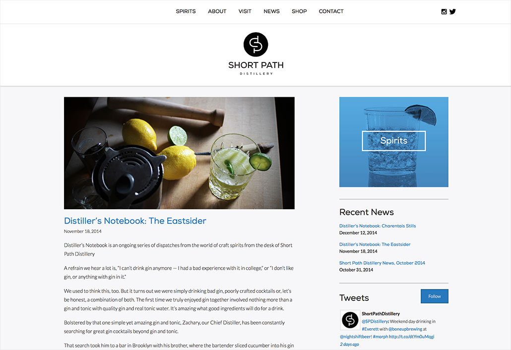
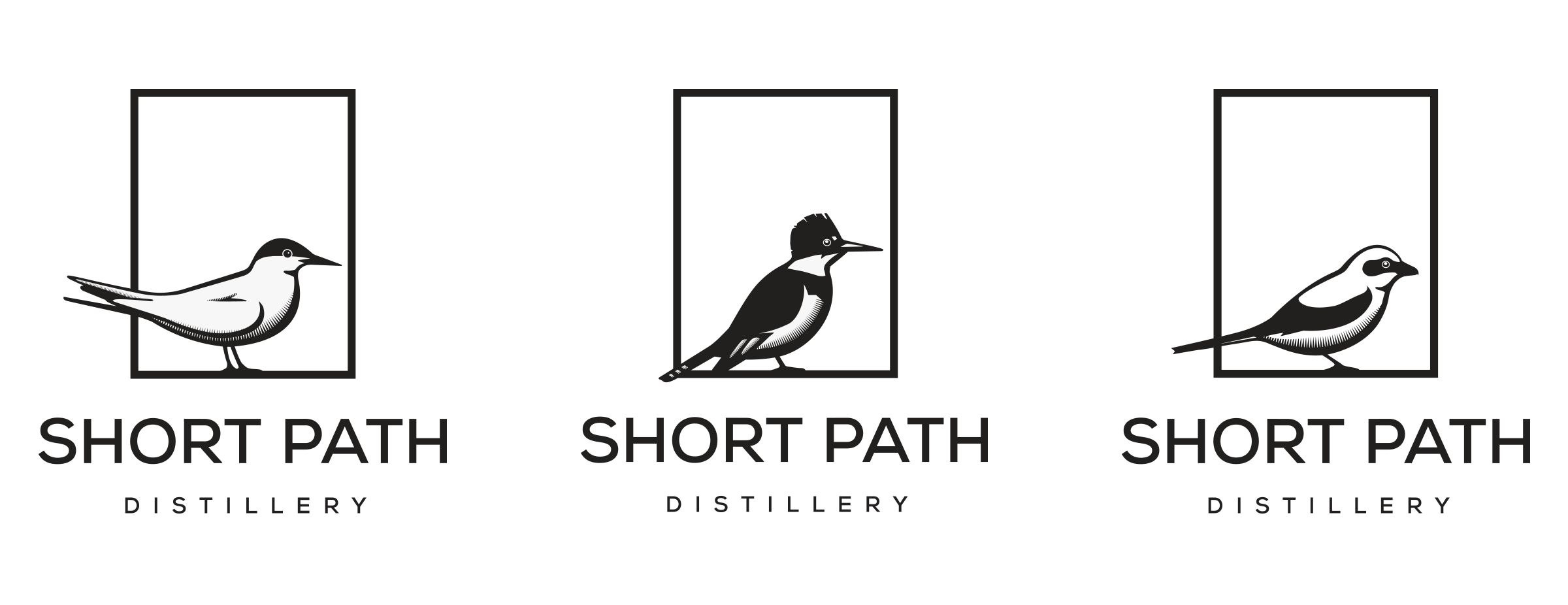
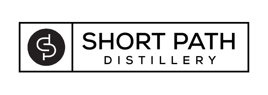
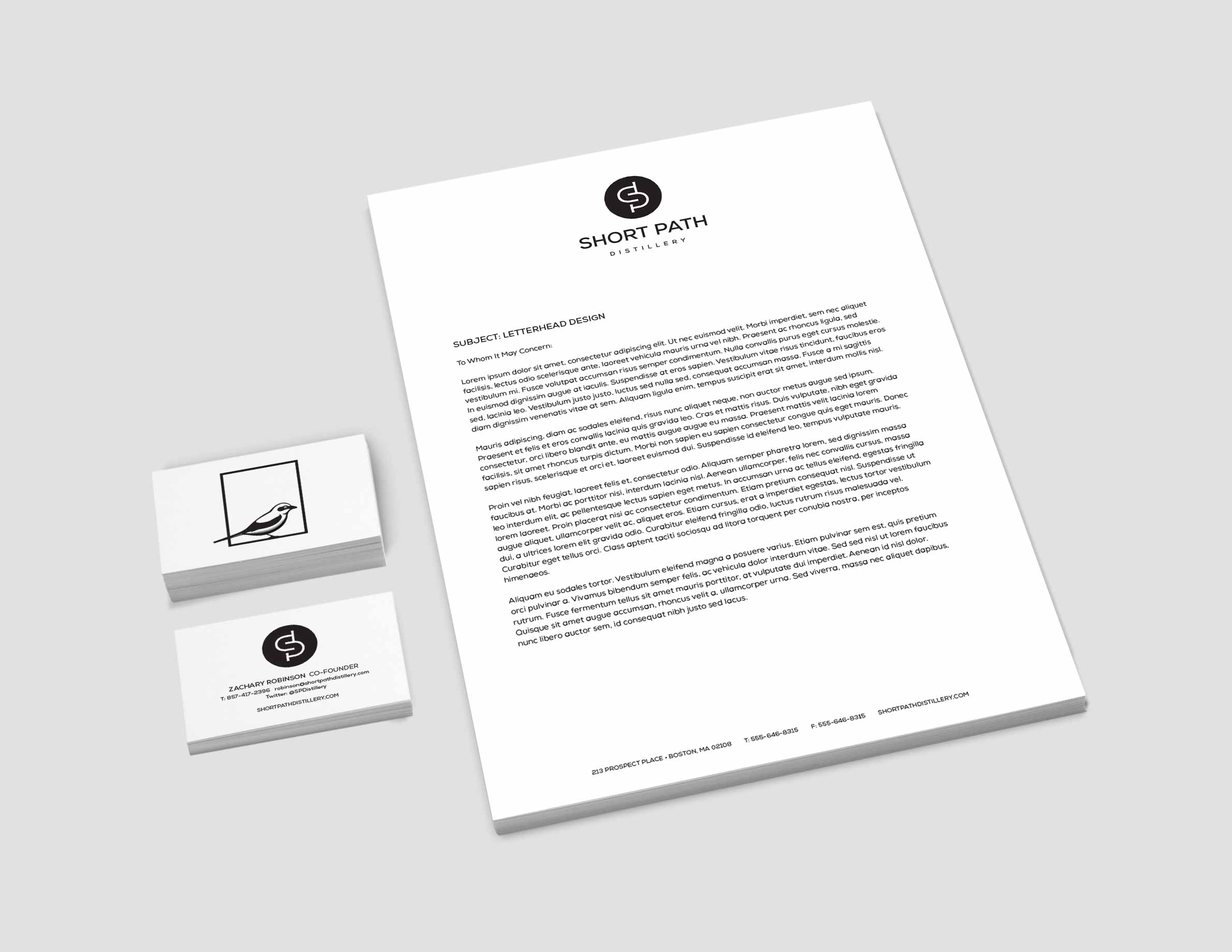
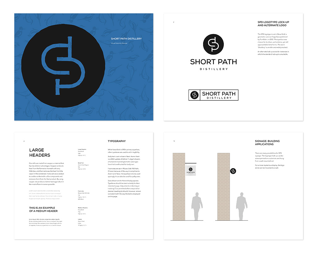
Short Path Distillery is a small batch distillery in Everett, Massachusetts. The logo is comprised of the letters “s”, “p”, and “d” meshed together to create a labyrinth, a visual representation of the journey the founders took to create their brand of spirit. The identity system also incorporates birds from the New England area, illustrated in a modernized woodcut style. The birds and color are used to differentiate the company’s spirits which are gin, rum, and whiskey.